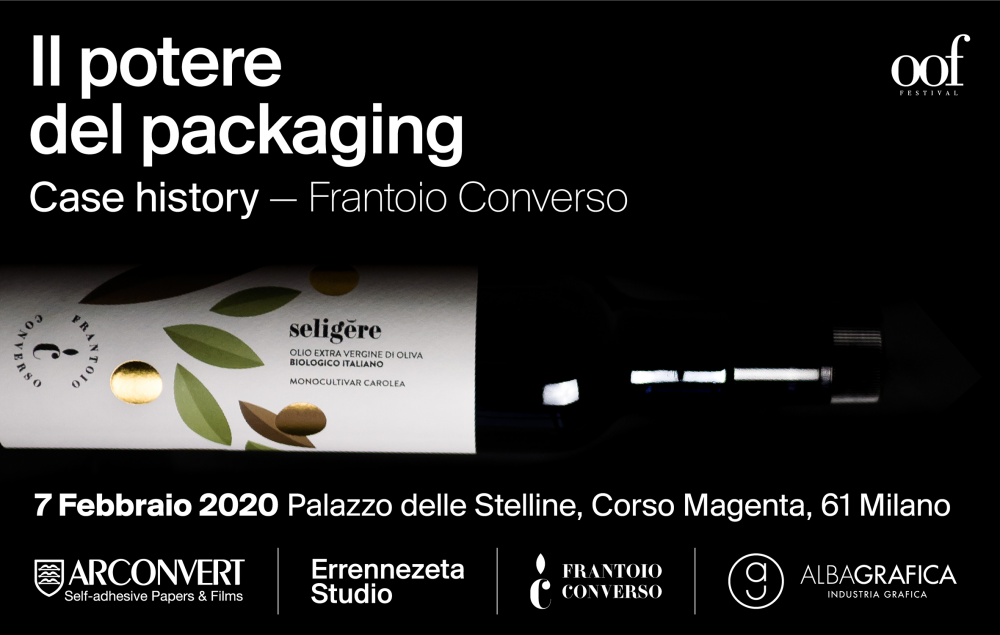
Oil Workshop Festival
Case History - Converso oil mill
An innovative, strong and powerful packaging project which was presented during the award ceremony at Le Forme dell'Olio 2020, the Packaging and Visual design competition dedicated to olive oils by Olio Officina, recounting the birth and the creative process.
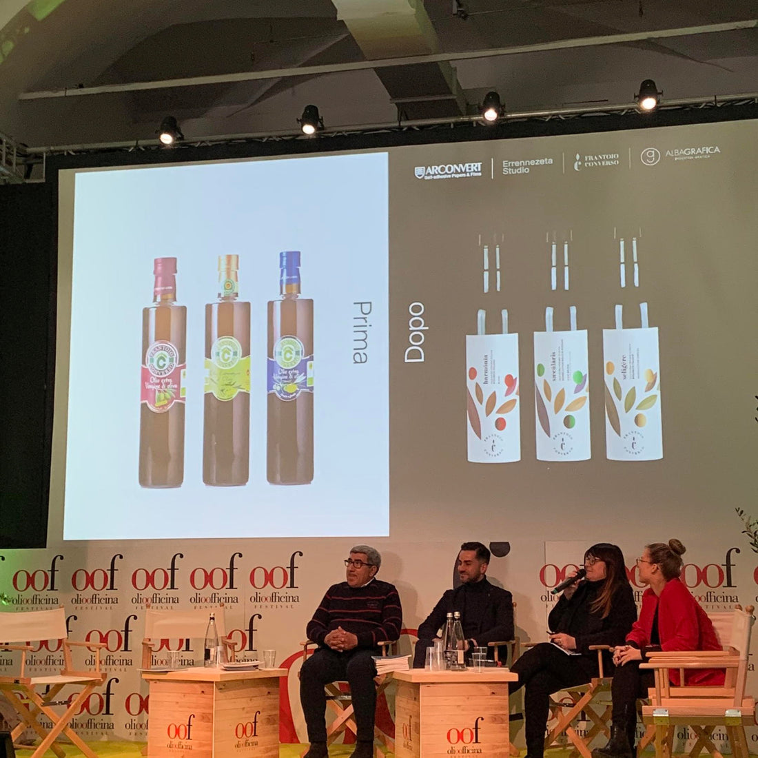
Guglielmo, Emma and Giandomenico had long been looking for a graphic project that could best communicate the value of the bottle's contents, in an original and distinctive way. Their intent was not only to increase sales through the new product image, but to tell their story about the label, in an innovative way. So it was that they turned to Alessandro Renzelli, the young art director of Errennezeta Studio, who managed to creatively represent the storytelling of the Frantoio Converso with colours, shapes and phrases.
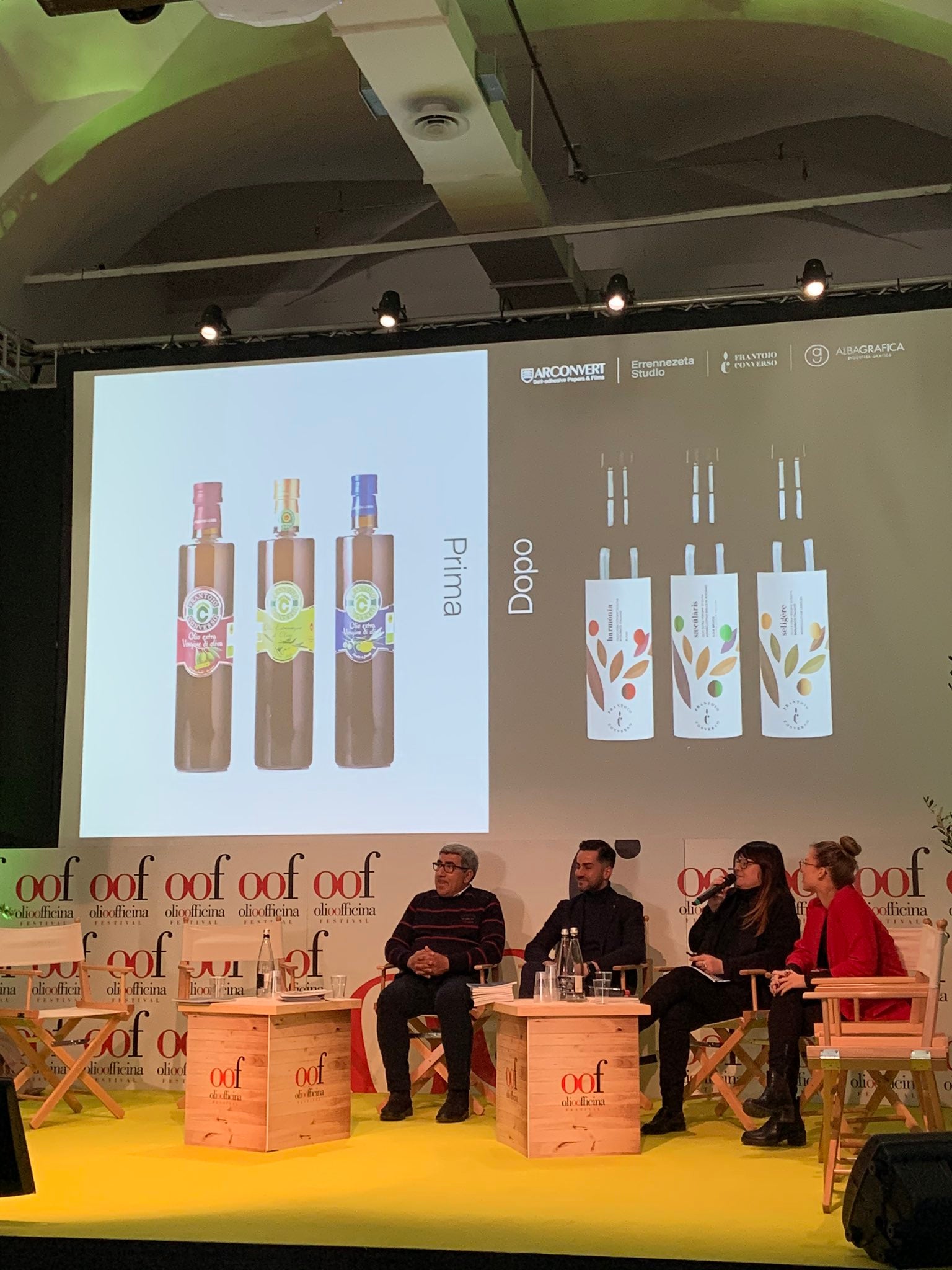
This is how the three new bottles are born:
-
saecŭlāris from the secular Latin, in honor of the centenary trees of the Dolce di Rossano cultivar of the Converso family olive grove.
seligĕre from the Latin to choose, because the olives of the oil contained within it are selected and harvested on the plant, nothing is harvested from the ground, as taste and quality would be compromised.
harmŏnĭa dal latino harmony, the one that binds the cultivars of this blend winner of numerous awards. An intense blend, the perfect harmony of flavours, between bitter and spicy.
The three circles depicted on each bottle represent the three generations of the Converso family; the color of the circles depicts the color of the oil based on the contents of the bottle, from golden yellow to intense green. The central leaves depict the aftertaste and the larger ones the right point of maturation of the oil.
A project to be discovered and told.